Project Overview
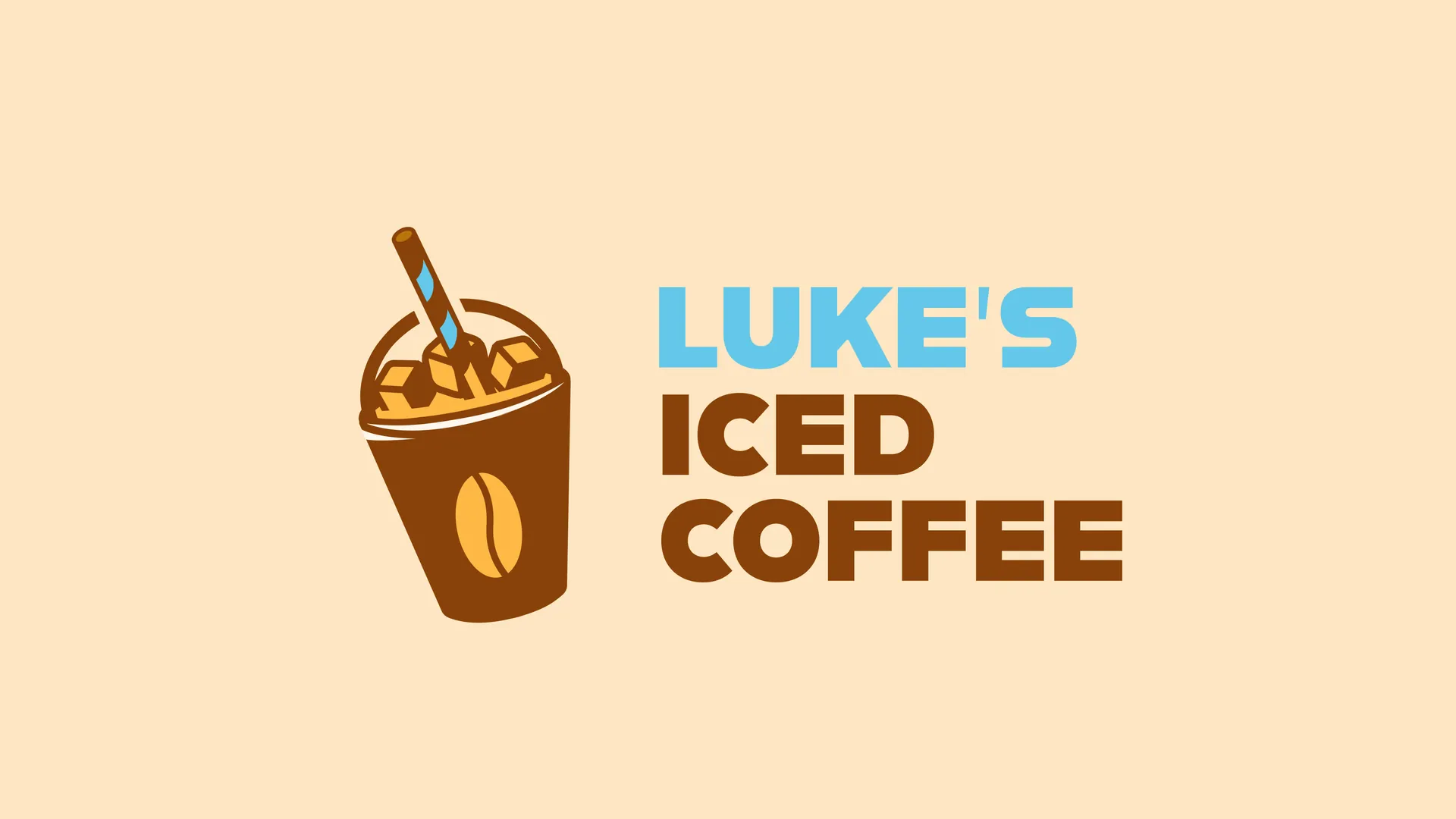
Luke's
Iced Coffee
Deliverables
Targeted collateral design — logo, menu layout, business cards, and packaging system.
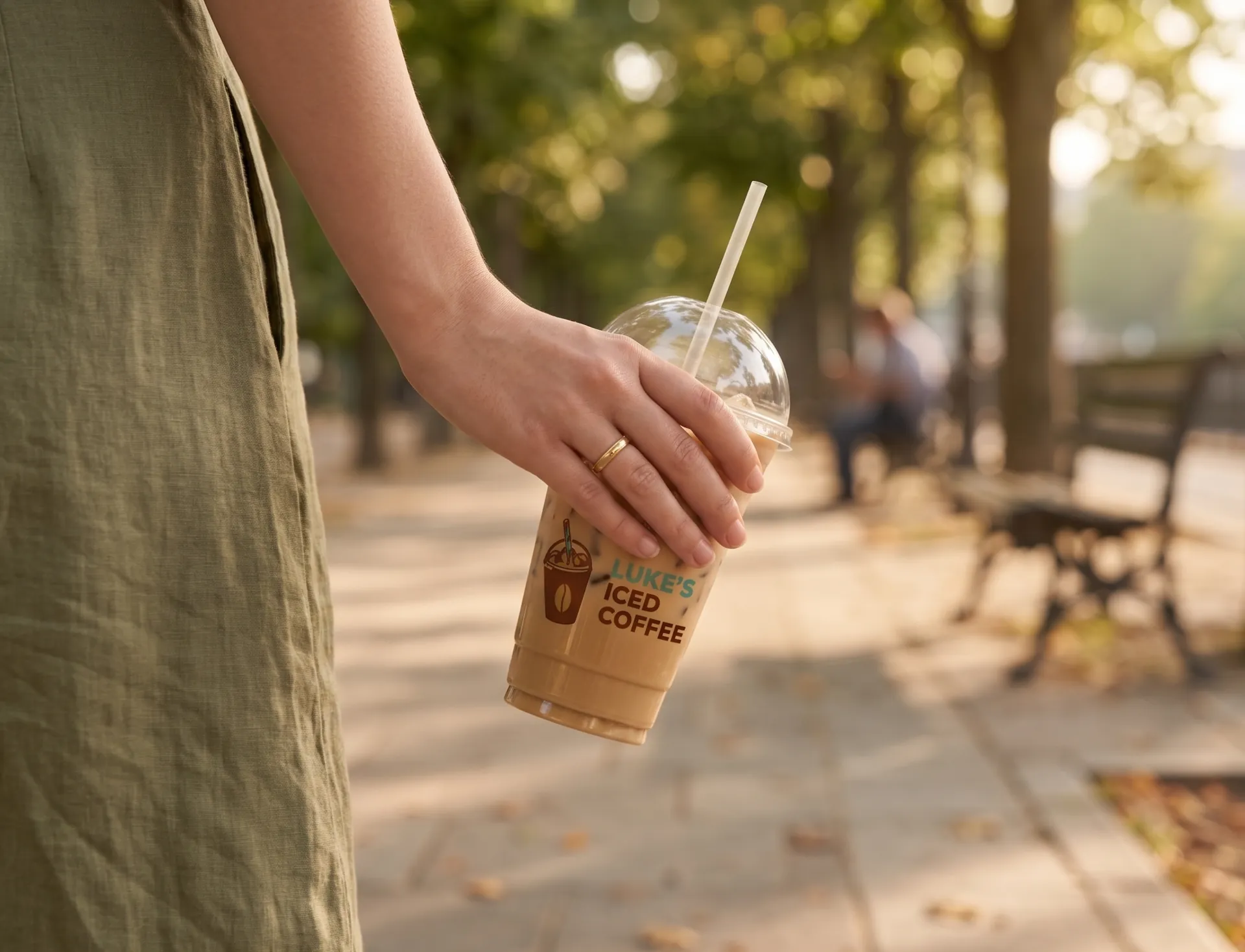
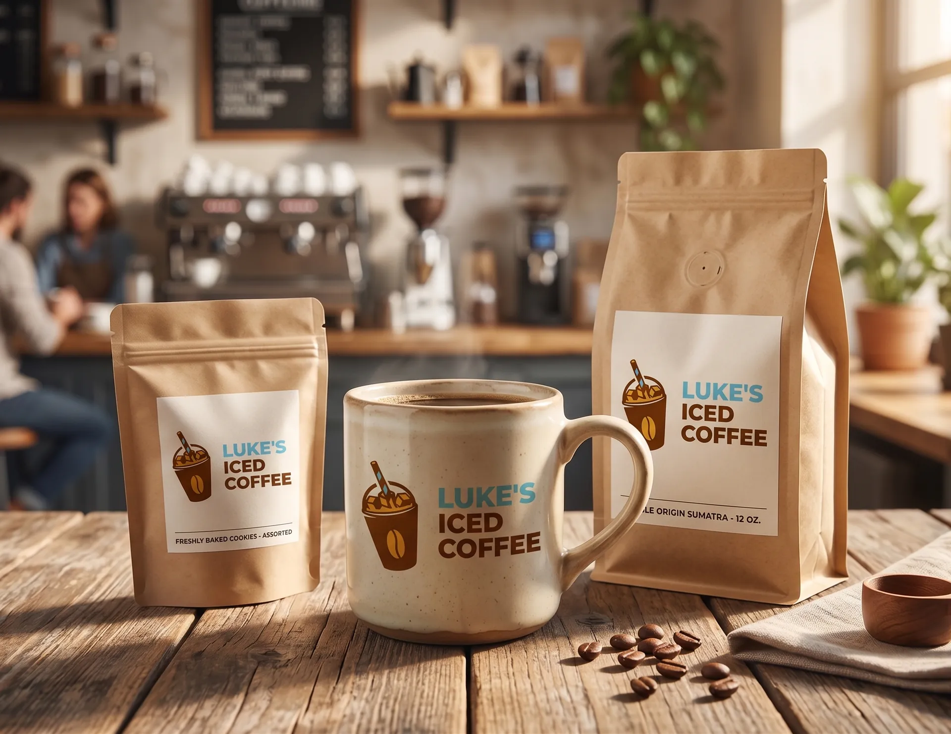
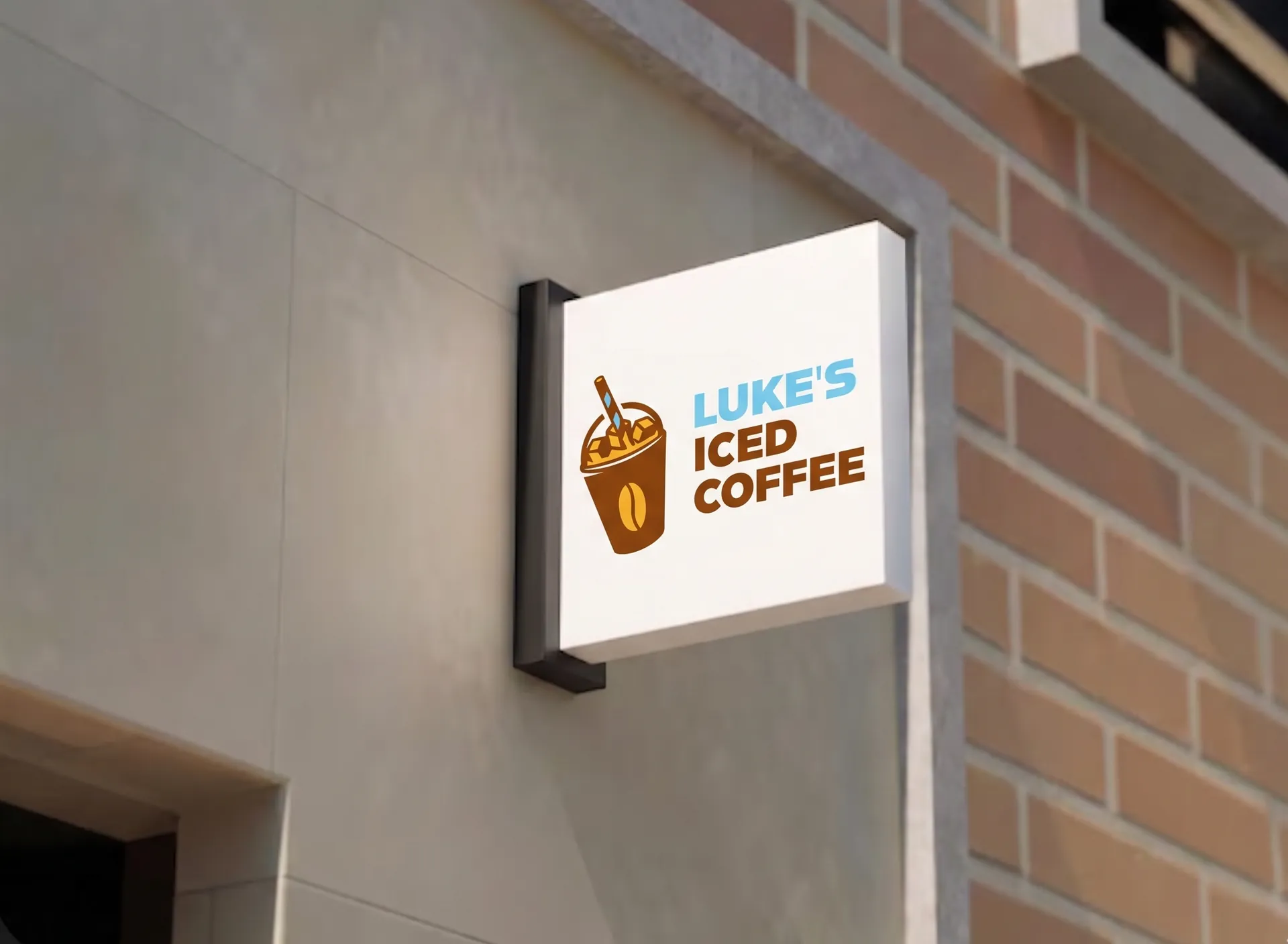
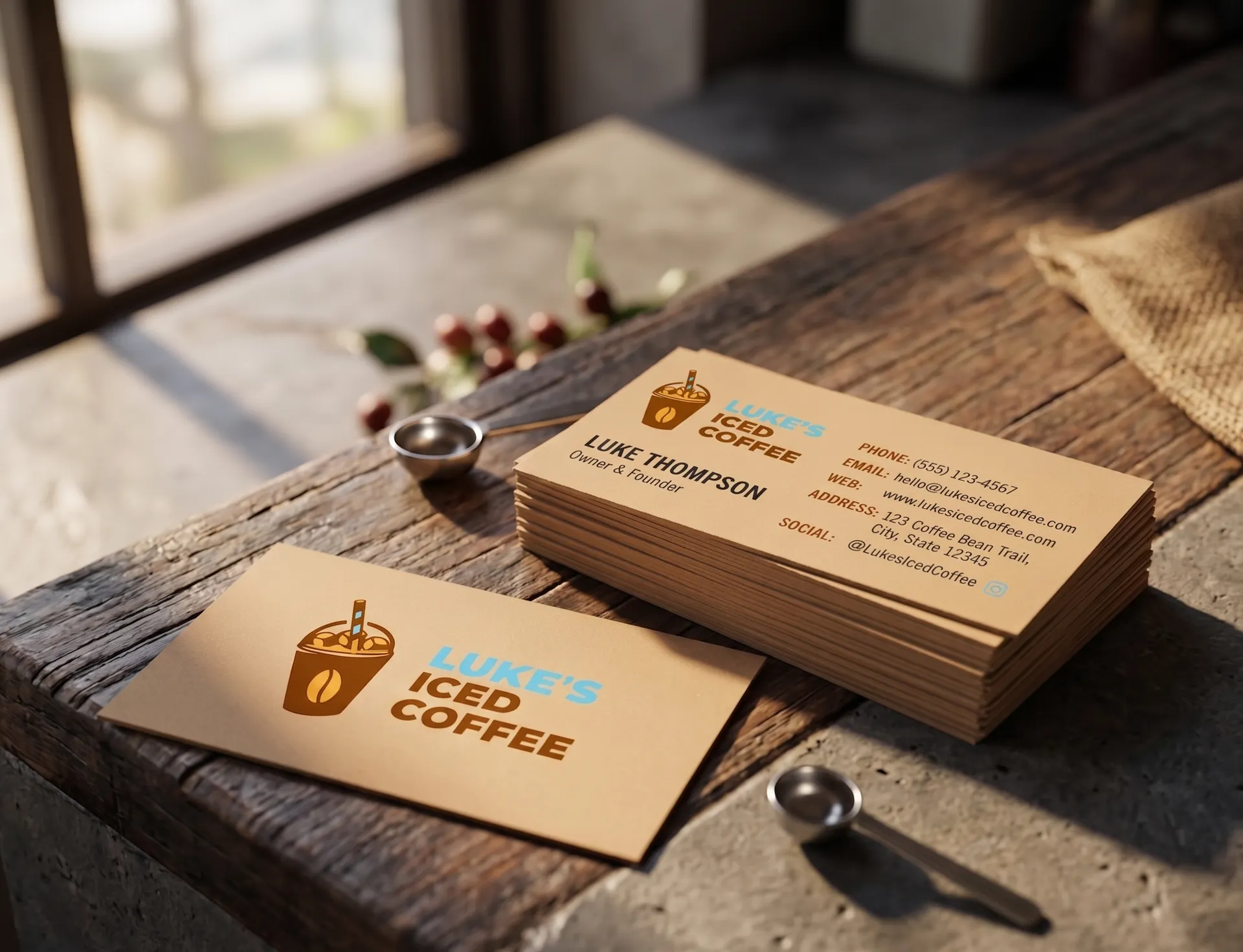
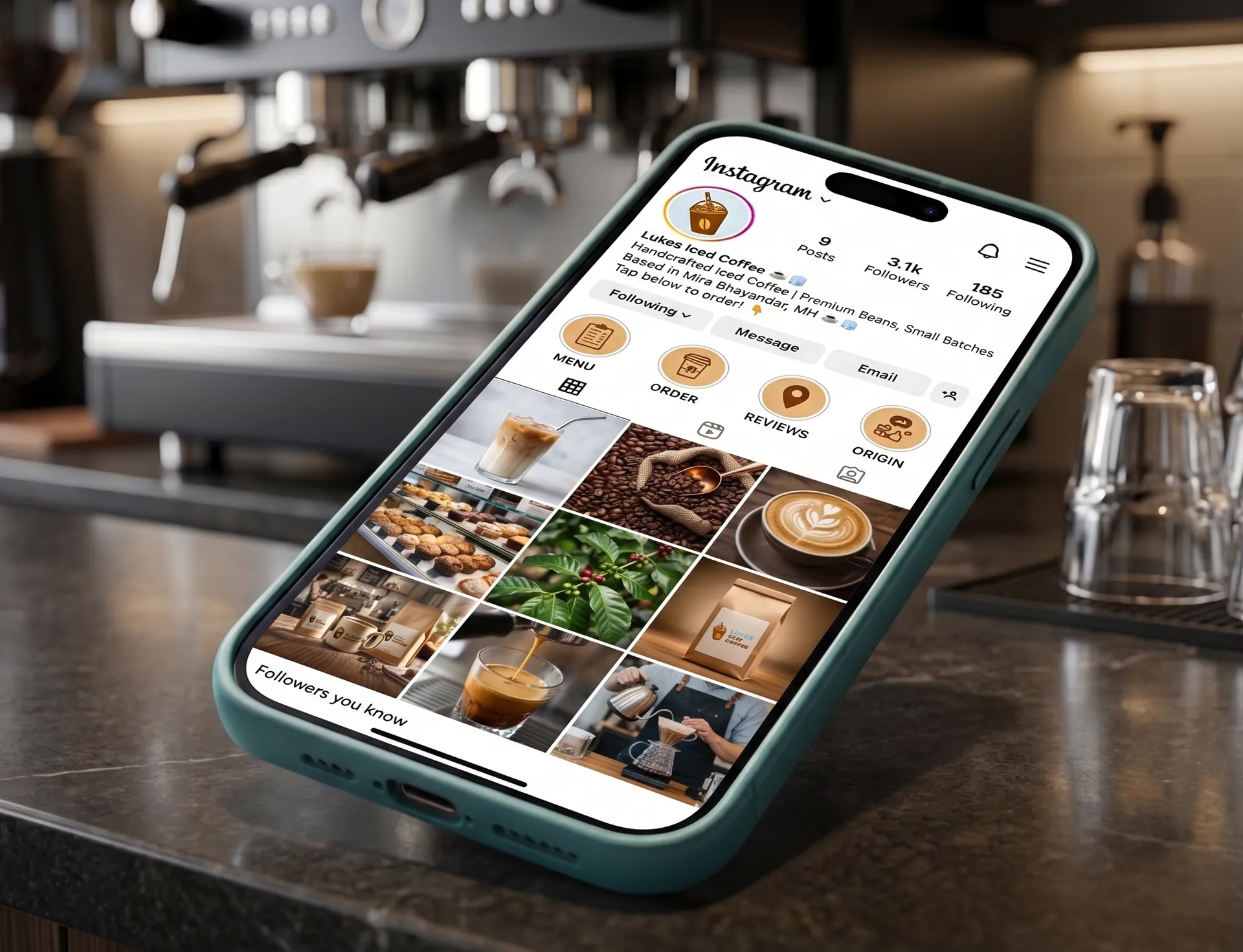
Brand Applications
In context.
Colour Palette
Warmth & Cold.
Two opposing tones — coffee brown and iced blue — create the core tension of the brand. Minimal palette, maximum recognition.
Base
Warm Cream
Primary
Coffee Brown
Secondary
Iced Blue
Highlight
Sunset Orange
02 / Problem
Outdated collateral.
Low shelf impact.
Luke's had a great product, but their touchpoints — packaging, menus, and business cards — failed to communicate what made them unique. The logo lacked legibility, and the physical items didn't feel cohesive.
03 / Direction
Young. Bold.
High contrast.
The goal was to redesign specific core assets to appeal to a Gen-Z and student demographic. Every delivered piece needed to feel punchy, modern, and instantly recognizable.
04 / Design Decisions
What the system needed:
Logo
Bold wordmark. Confident and legible on small labels.
Menu & Print
Clear typographic hierarchy. Functional business cards.
Packaging
High-impact layout rules that work across cups and cans.
Target: Gen-Z and students. Everyday product, premium feel.
05 / Approach
High contrast.
High energy.
Kept the design expressive but controlled. Strong type hierarchy, a two-tone palette, and clean layout rules that work across cups, packaging, and digital.
06 / Deliverables
Logo Design
Primary wordmark and lockup variations.
Print Assets
Menu layout and two-sided business cards.
Packaging
Cup designs and retail product packaging.
07 / Result
Targeted deliverables ready for production.
Logo files, print-ready menus, business cards, and packaging mechanicals delivered.